Essential Color Palettes for Impressionist Landscapes: What to Mix and Why
Most beginners reach for a tube of ultramarine, squeeze out a cadmium red, and wonder why their landscape looks like a color wheel exploded rather than a
Most beginners reach for a tube of ultramarine, squeeze out a cadmium red, and wonder why their landscape looks like a color wheel exploded rather than a field in late afternoon light. Impressionist landscape painters worked the opposite way. They narrowed their choices down to a handful of pigments and let mixing do the work that a crowded palette never could. This guide gives you that smaller set: the actual pigments, the ratios, and the reasoning behind each mix, so you can load a palette knife today instead of reading another explanation of why broken color matters.
Why a limited palette makes Impressionist color work
A palette with twenty colors gives you twenty ways to make mud. A palette with seven or eight gives you a system: every color you mix shares pigment with every other color on your canvas, so the whole painting holds together even when individual strokes sit side by side unblended.
This is the practical reason Impressionist painters restricted their kits. Pure, high-chroma color straight from the tube reads as flat and artificial next to the broken, vibrating color of outdoor light. Mixed color, built from two or three pigments in careful proportion, carries more information: a slightly greyed blue, a yellow leaning toward green, an almost brown violet. Limiting your pigments forces you to build that complexity through mixing rather than reaching for a convenient tube that happens to be close.
The core palette: the pigments most Impressionist landscape painters kept on hand
You do not need a full art store to start. A working Impressionist landscape palette covers warm and cool versions of the three primaries, plus white, and that is close to all you need:
3:2. Describe
- Cadmium yellow (warm yellow)
- Lemon yellow or cadmium yellow pale (cool yellow)
- Cadmium red or vermilion (warm red)
- Alizarin crimson or quinacridone rose (cool red)
- Ultramarine blue (warm blue, leans violet)
- Cerulean blue or cobalt blue (cool blue, leans green)
- Viridian or a transparent green (optional, used sparingly)
- Titanium white or lead white
Leave black and ivory black off the palette entirely, or set them aside unused. Every shadow and every dark in this guide comes from mixed complementary color, not from a tube of black, and that single substitution does more to make a painting look like outdoor light than almost any brush technique.
Having a warm and cool version of each primary means you can lean a mix toward vibrancy or toward grey without introducing a fourth pigment. That is the entire trick behind palettes that stay clean after an hour of mixing.
Mixing vibrant skies without reaching for pure blue from the tube
Pure ultramarine or cerulean straight from the tube reads as a swatch, not as sky. Real sky color shifts constantly, warmer near the horizon, cooler and more saturated overhead, and greyed wherever haze or cloud interrupts it.
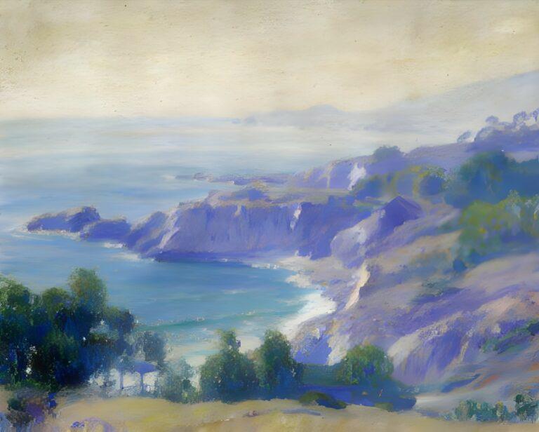
For an overhead summer sky, mix cerulean blue with a touch of titanium white and a whisper of cadmium yellow pale. The yellow does not turn the mix green; it knocks back the blue’s intensity and warms it just enough to feel like air rather than paint. Near the horizon, where the sky pales and warms, add more white and a small amount of alizarin crimson instead of yellow, which shifts the mix toward a soft lavender-grey rather than a chalky pale blue.
For a stormier or overcast sky, swap cerulean for ultramarine and add a touch of cadmium red alongside the white. This gives you a warm grey-violet that still reads as sky but carries the weight of changing weather. Avoid mixing the cool blue and warm blue together on impulse; keep them in separate family mixes so your sky doesn’t collapse into a single flat hue across the whole canvas.
Greens that don’t go muddy: foliage mixes for spring, summer, and autumn light
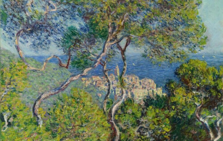
Straight-from-the-tube green is the fastest way to flatten a landscape. Built greens, mixed fresh for each area of foliage, carry the variation that makes trees and fields look alive.
- Spring foliage: lemon yellow with a small amount of cerulean blue, kept light and warm. Add white sparingly; spring green should stay slightly transparent and yellow-dominant.
- Summer foliage, sunlit: cadmium yellow with ultramarine blue in roughly a two-to-one ratio favoring yellow, then warmed further with a touch of cadmium red for the yellow-greens that catch direct sun.
- Summer foliage, shadowed: the same base mix, but shift the ratio toward blue and add a touch of alizarin crimson instead of white. This keeps the shadow green cool and rich rather than grey.
- Autumn foliage: cadmium yellow and cadmium red mixed directly, with only a trace of blue if any green is needed at all. Most autumn color is closer to orange than green, and treating it that way keeps the passage warm instead of forcing it back toward a cooler palette.
The mistake to avoid is mixing one “tree green” and using it everywhere. Vary the ratio stroke by stroke, even within a single tree, and the foliage will hold light the way it does outdoors.
Capturing water and reflected color without overworking the mix
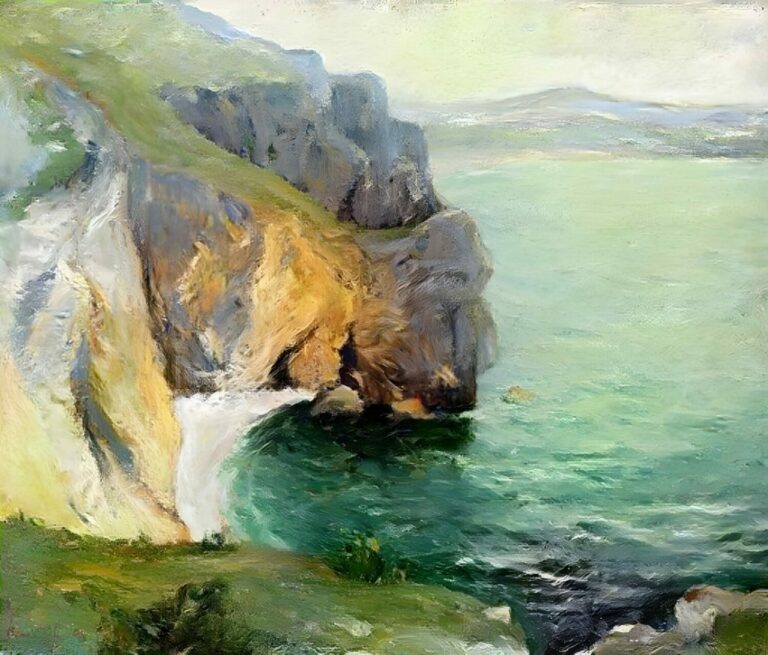
Water is rarely blue in practice. It is a mirror for whatever sits above and around it, so the fastest way to paint convincing water is to reuse the colors already on your palette from the sky and the bank, rather than mixing a dedicated “water blue.”
Take your sky mix and grey it down slightly with a touch of its complement, then lay it in with horizontal strokes. Where the bank or foliage reflects into the water, pull the green mixes down into the water passage directly, softened with a little white and a touch of the sky color to keep them connected to the light above. Keep your brushwork horizontal and avoid stirring the paint too long on the canvas; water in an Impressionist landscape depends on broken, separate strokes of related color rather than a smoothly blended surface. Overworking a water passage is the single fastest way to lose the shimmer that makes it convincing.
Painting sunlight and shadow with complementary color instead of black
Shadows mixed from black and a local color go flat and dead. Shadows mixed from a color’s complement stay luminous, because they carry a hint of the opposite hue rather than simply darkening it.
For a shadow falling across grass, don’t reach for black or even a dark green straight from the tube. Mix your summer foliage green with a small amount of alizarin crimson, its rough complement, and you get a shadow that reads as cool and deep but still alive with color. For a shadow on a sunlit stone path, mix the path’s warm ochre or sienna base with a touch of ultramarine, its complement, rather than grey or black.
Sunlit highlights work the same way in reverse: a patch of grass hit directly by sun isn’t just a lighter version of the shadow green, it’s warmer, pulling toward yellow and sometimes toward the orange of direct light. Keep a small, separate mix on your palette for these highlights, built from your lightest warm yellow and white, and apply it in short, distinct strokes rather than blending it into the surrounding green.
Building a single landscape study using only this palette
Try one small study using nothing but the eight pigments above, worked across a single afternoon scene: a field, a line of trees, a strip of water, and open sky.
Block in the sky first with your mixed blue-and-white passages, warmer near the horizon. Move to the tree line next, building two or three distinct green mixes rather than one, and reserve your warmest yellow-green for any foliage catching direct light. Bring the water in using colors pulled down from the sky and tree mixes rather than a fresh blue. Finish with shadows mixed from complements, placed last so you can judge them against the color already on the canvas rather than in isolation on the palette.
Working this way, with a fixed set of pigments reused across every passage, is what gives an Impressionist landscape its unity. The painting holds together because the color does, not because every object was painted in its “correct” local color.
Where the palette meets technique
Pigment choice only carries a painting so far. How you apply the paint, the stroke length, the thickness, the order you lay colors down, matters just as much, and that side of the craft is covered in what techniques are used in Impressionist paintings. If you want the reasoning behind why this palette exists at all, and why Impressionist painters cared so much about capturing a specific moment of outdoor light rather than a generalized scene, that’s addressed directly in the significance of light in Impressionism.
If you’re working through this palette on your own canvases and want feedback, comparison, or just other painters tackling the same mixing problems, join my community.