Claude Monet Color Palette
I’m here to help you with a deeper appreciation of Claude Monet’s distinctive use of color, which was more than just a…
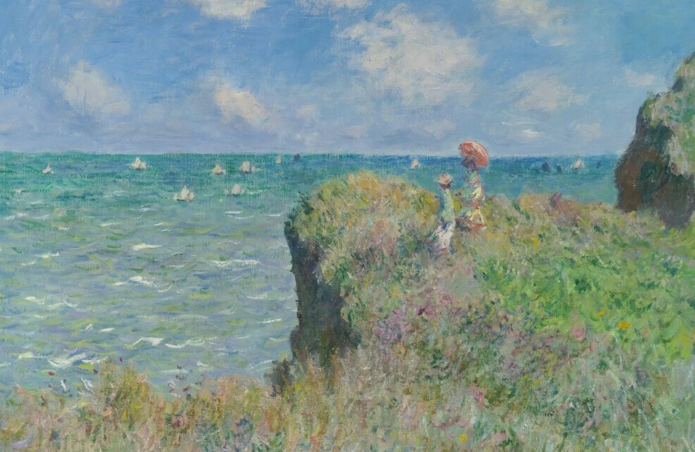
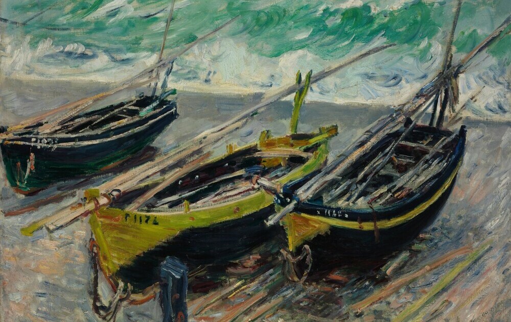
I’m here to help you with a deeper appreciation of Claude Monet’s distinctive use of color, which was more than just a stylistic choice – it revolutionized the art world. Monet’s approach to color wasn’t just about aesthetic pleasure; it was a radical method to capture the transient effects of light and atmosphere on the landscape.
This isn’t just about blue skies and green fields. Monet’s color philosophy embraced a dynamic range often overlooked by the casual observer. You’re going to find out about his rejection of the black paint used for shadows, instead opting for purples, blues, and greens to reflect the true subtleties seen in nature.
Key works like ‘Impression, Sunrise’ and ‘Water Lilies showcase Monet’s pioneering approach. Each stroke of color serves a deliberate purpose, whether to depict the fleeting moment of sunrise or the ever-changing surfaces of a pond. It’s the savvy interplay of hues that guides your eye across the canvas in a rhythmic dance.
And consider this: Monet’s venturing into Impressionism wasn’t a solo journey. It was a collective movement that influenced how he and his peers approached color. They moved away from exact representation, focusing instead on the effect of natural light, which brought a whole new emotional depth to their canvases.
The psychological impact of Monet’s choices cannot be overstated. He knew the power of color to evoke feelings and moods. For instance, the serene blues and calming greens often seen in his seascapes aim to soothe, while the vivid reds and oranges in his sunsets ignite the sky with passion. Monet’s canvases are much more than mere paintings; they’re an experience, inviting viewers to fall into a world driven by sensation and emotion.
Curating Your Palette: Drawing Inspiration from Monet
Now that you’ve explored the colorful expressiveness of Claude Monet’s work, you might be itching to infuse some of his techniques into your creative endeavors. Monet’s palette, rich with nuanced hues and delicate shadings, can be a source of inspiration for modern artists and designers looking to capture an impression of light and mood in their compositions.
Choosing colors that resonate with Monet’s style isn’t just about selecting the right shades—it’s about embracing a brave approach to color relationships. Study the impressionist’s work to understand how he juxtaposed colors to mimic the transient effects of light. Pay close attention to the way he layered his brushstrokes, allowing the colors to blend and interact on the canvas itself.
Here are a few tips to help you weave some Monet magic into your art: Seek out those transitional moments in nature where colors defy expectation; practice plein air painting to grasp the changing light; and don’t be afraid to experiment with different color combinations and consistencies of paint—after all, Monet was a trailblazer in the art of breaking traditions.
Beyond art, Monet’s understanding of colors can enrich our appreciation of the visual world and influence design elements in our daily lives. From interior design that captures the essence of different lighting conditions to clothing that reflects a contemporary yet timeless aesthetic, the principles of Monet’s color palette remain relevant and wonderfully adaptive.
The genius of Claude Monet’s color palette endures, not only as an integral part of his masterpieces but as part of the creative collective consciousness. Whether you’re an artist, a designer, or simply someone who enjoys the splashes of color in everyday life, there’s plenty to learn from the impressionist maestro’s approach to color. His legacy is not set in museum walls—it continues to flow and adapt, just like the ever-changing light he sought to capture.


