Mastering the Impressionist Palette: Color Choices and Harmonies
Impressionism, an art movement that emerged in the late 19th century, revolutionized the way artists approached color and light in their paintings….
Impressionism, an art movement that emerged in the late 19th century, revolutionized the way artists approached color and light in their paintings. Characterized by its emphasis on capturing the fleeting effects of light and atmosphere, Impressionist art is celebrated for its vibrant and dynamic use of color. Mastering the Impressionist palette involves understanding the principles of color choices and harmonies that define this influential movement.
- The Importance of Light:
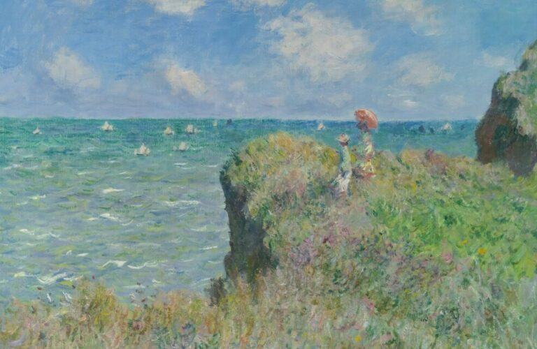
Impressionist painters were captivated by the play of light and its transformative effects on the world around them. To master the Impressionist palette, artists must prioritize the depiction of light in their work. Choose colors that convey the shifting nuances of light, from the warm glow of sunlight to the cool tones of shadows. Yellow ochre, cadmium yellow, and titanium white are essential colors for capturing the brilliance of sunlight, while cobalt blue and viridian green are often used to portray the coolness of shadows.
- Broken Color Technique:
One hallmark of Impressionist painting is the “broken color” technique, where artists apply small strokes or dots of pure color next to each other, allowing the viewer’s eye to blend them optically. This technique creates a sense of luminosity and vibrancy in the artwork. Experiment with broken color by using a variety of brushstrokes and applying complementary colors in close proximity to enhance the visual impact.
- Limited Palette:
While the Impressionist palette is known for its vibrancy, artists often worked with a limited selection of colors. This limitation forces painters to mix colors directly on the canvas, contributing to the overall harmony of the piece. Commonly used colors in the Impressionist palette include cadmium yellow, cadmium red, ultramarine blue, viridian green, and burnt sienna. A restrained palette allows artists to focus on the relationships between colors and create a unified and harmonious composition.
- Atmospheric Perspective:
Impressionist artists sought to capture the atmospheric conditions that influenced the appearance of a scene. To achieve this, they used color to convey depth and distance. As objects recede into the background, colors become cooler, lighter, and less saturated. Utilize this principle in your paintings by adjusting the intensity of colors to create a sense of depth and atmosphere, enhancing the overall impression of the scene.
- Complementary Color Harmonies:
Impressionist paintings often feature complementary color harmonies, where colors opposite each other on the color wheel are used to create dynamic contrast and visual interest. Experiment with complementary color schemes to infuse energy into your compositions. For instance, juxtapose warm tones like red and orange against cool tones like blue and green to achieve a visually striking effect.
Conclusion:
Mastering the Impressionist palette involves a deep understanding of color choices and harmonies that emphasize the play of light, broken color techniques, limited palettes, atmospheric perspective, and complementary color harmonies. By embracing these principles, artists can capture the essence of Impressionism and create paintings that evoke the beauty and vitality of the world around them.
Benjamin Johnson, Artist | Author